Here is the second set of book covers. Any likes or dislikes?
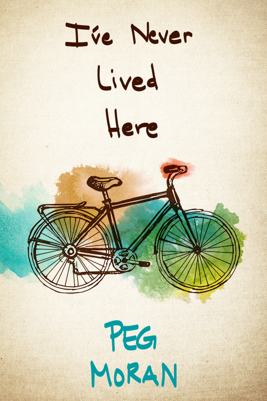
Here, the designer tried making the bike larger. As in the old cover of the boy and the bike, the imperfect watercolors represent the imperfect lives of the characters.
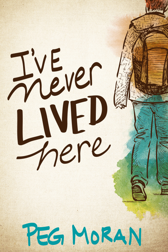
Some people felt they didn’t know where to look with the cover that had the boy and the bike. So here’s one with just the boy, arriving or leaving.
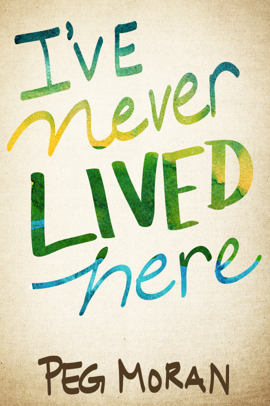
Some folks didn’t like the small bike on the cover. You’ve seen the cover with the larger bike. Now this one has no bike, but just the beautiful lettering.
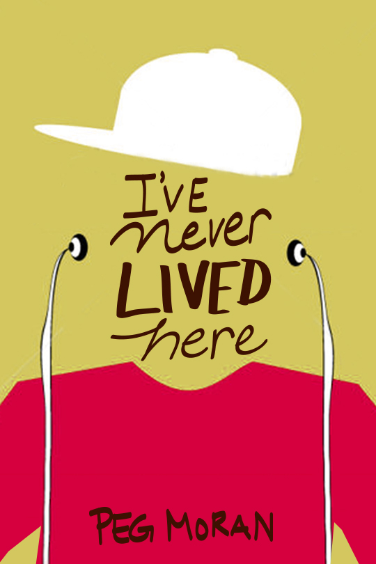
And here we have a completely different direction.
